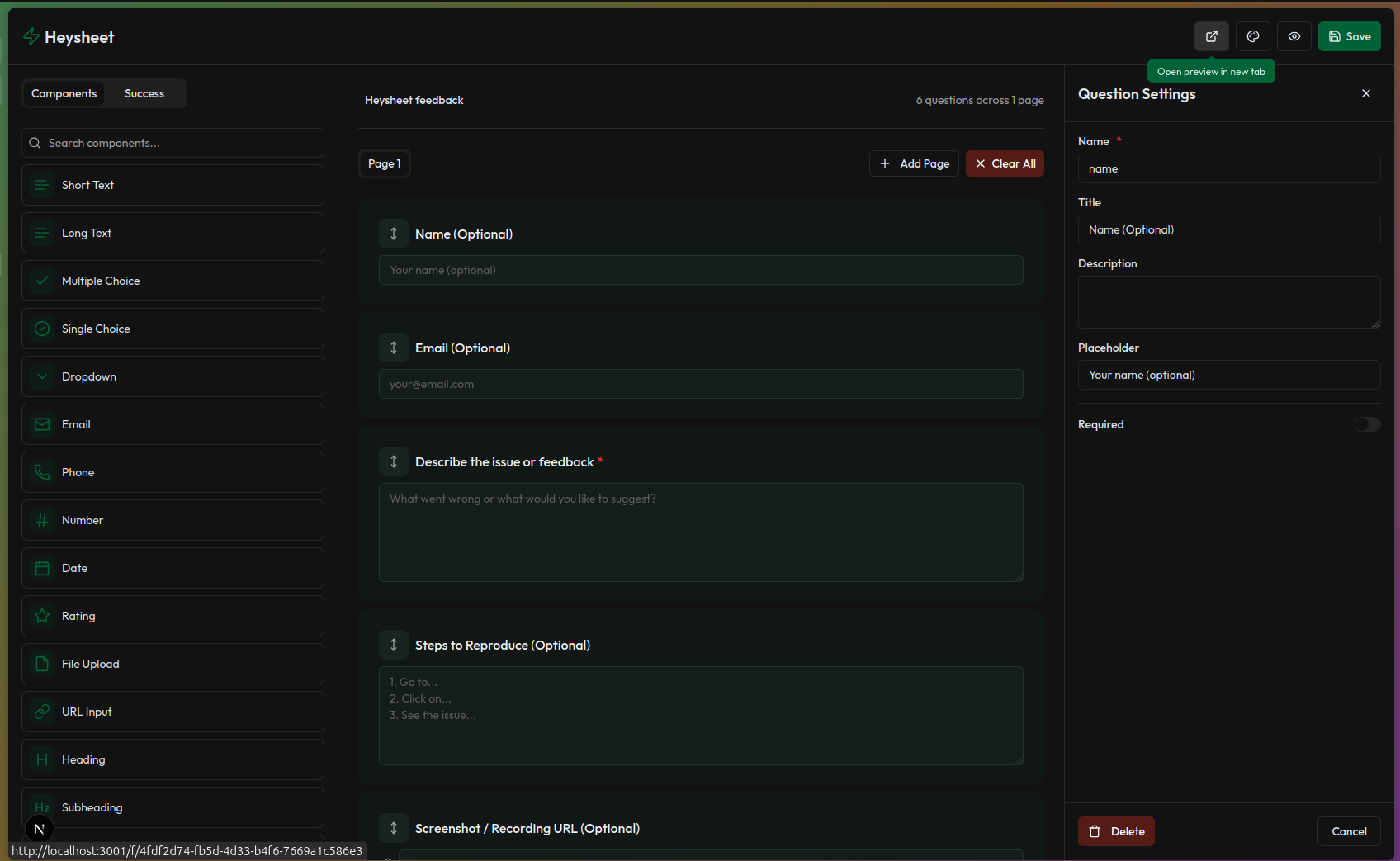
Form Builder
Customize your form visually with our drag-and-drop builder
The Form Builder lets you visually build and customize your forms — no code required. Start from scratch, use a pre-designed template, or modify one of your existing forms.
Accessing the Builder
After creating a form, go to the Form Detail page and click “Form Builder Editor”. This opens the builder canvas where you can visually design your form.
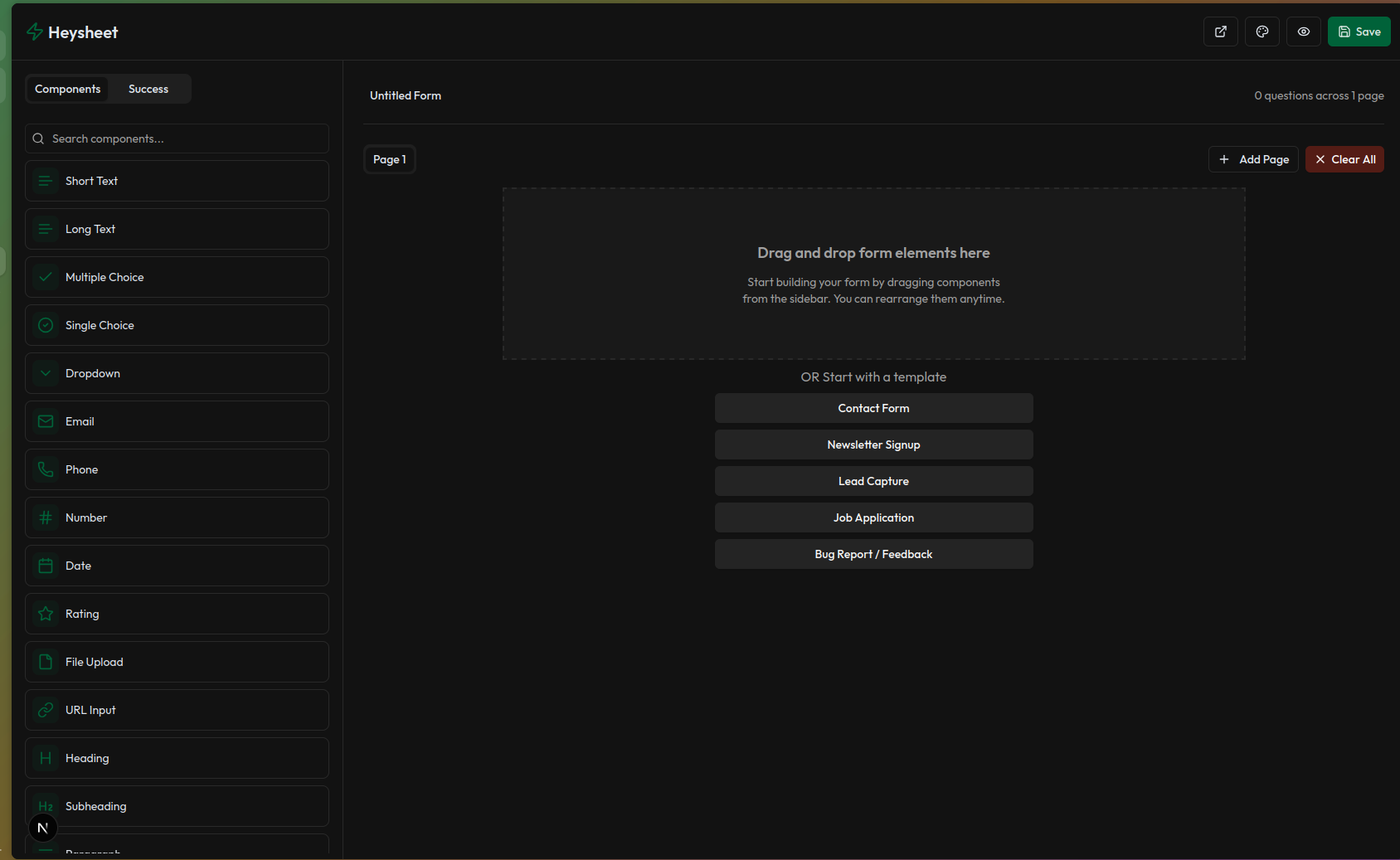
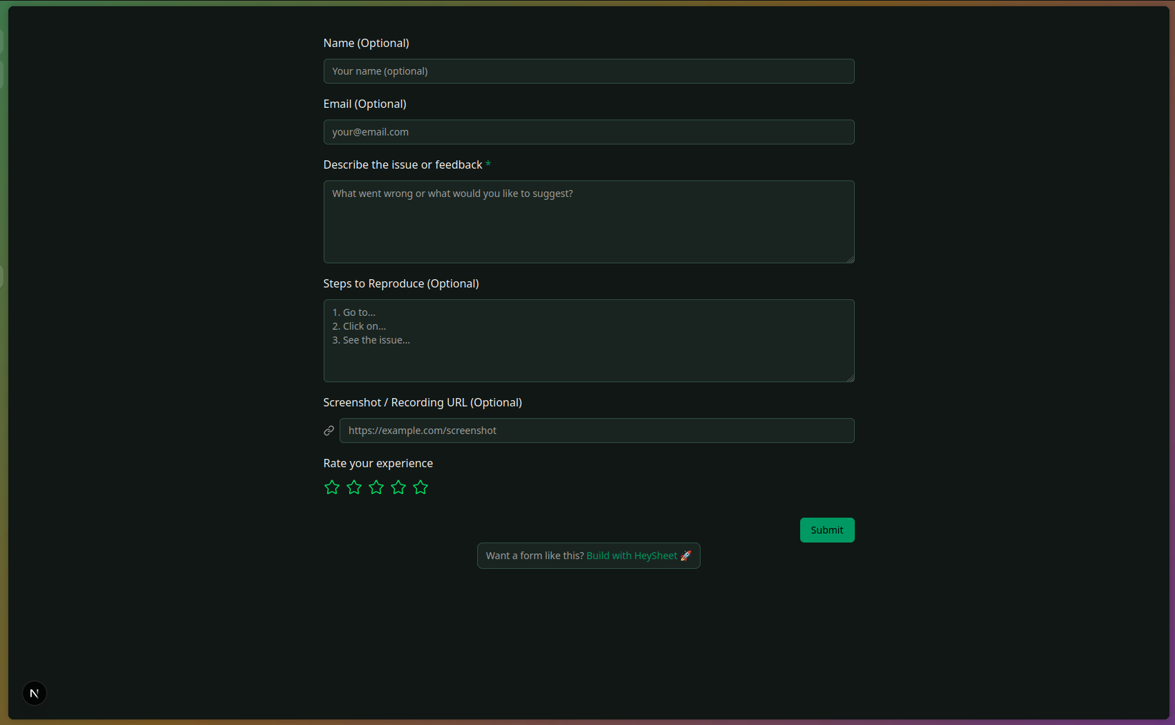
Adding Fields
Drag components from the sidebar and drop them onto the canvas. You can add:
- Short Text
- Long Text
- Dropdown
- Radio buttons
- Checkboxes
- Email and Phone fields
- File Upload (available on paid plans)
- Heading
- SubHeading
- Paragraph
- Date picker
- Phone
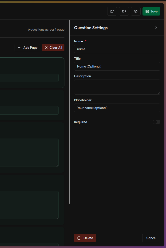
Customizing Components
Each field can be edited by clicking on it. You can:
- Change label, placeholder, and help text
- Mark fields as required
- Add options (for dropdowns, checkboxes, etc.)
- Reorder or remove fields
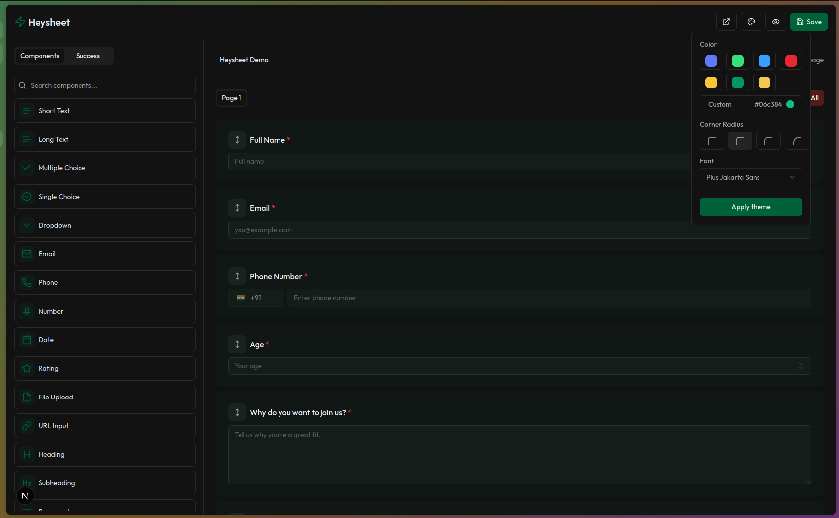
Theming & Branding
Click on the 🎨 Theme icon in the top right to:
- Choose from predefined themes
- Customize colors
Previewing the Form
Click the 👁 Preview button to see how your form looks to users. This helps test layout and theme before sharing.
Saving Changes
Click Save after you’re done customizing. This will persist your changes and update the public version of your form.
Sharing Your Form
- Use the “Open Preview in New Tab” button to view and share the public form link.
- Or go back to the Form Detail page and copy the Public URL under the Configuration tab.